

Free Colouring Sheets
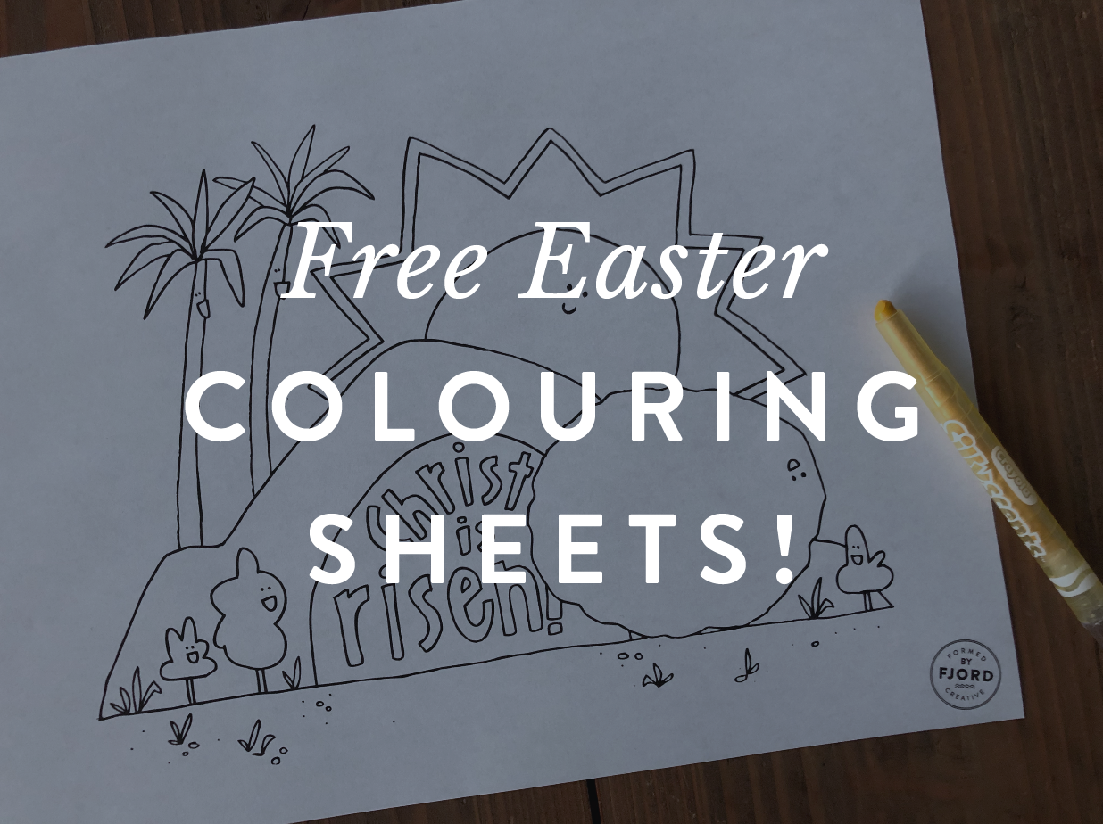
Looking for free colouring sheets to brighten up your days? I’ve created a bunch this year, inspired by a need to connect in an isolated version of our world. There’s not a lot I can do to help my fellow man, but spread some cheer. So far we’ve got: easter, mothers day, fathers day, and infant loss awareness. I missed thanksgiving, my bad! Check back for Christmas!
So cheers! Check out the free sheets, print, give them a scribble, and then let me see!
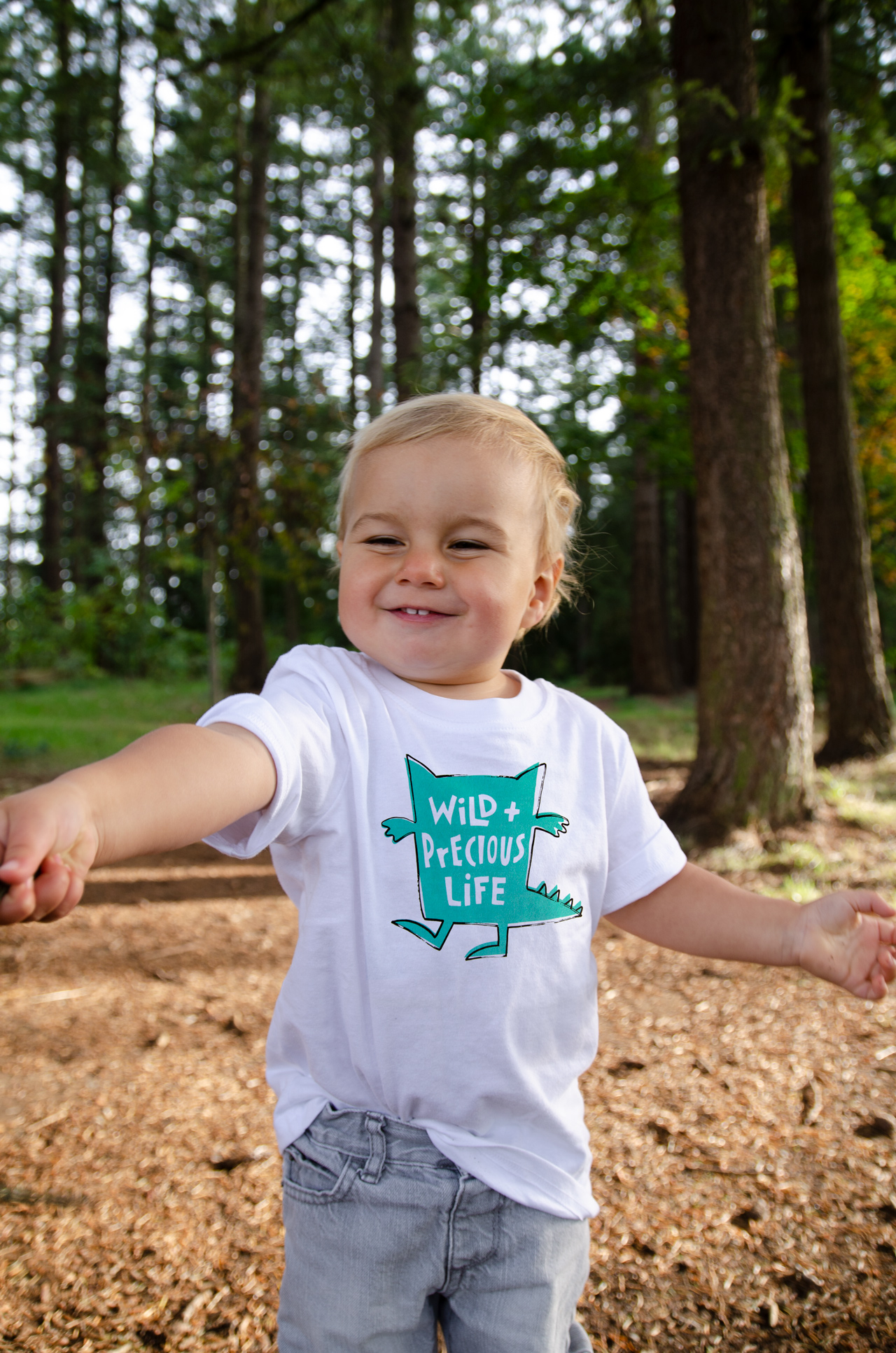
Pregnancy and Infant Loss Awareness: Wild + Precious Life

October 5 is Kohen’s 2nd birthday. For the second time in my life, I’ve anticipated October 5 with grief and confusion and a desire to come up with some way to honour my nephew. Its still new to me, this grieving process. Theres this feeling that I don’t want to just be sad – I want to DO something with the time and energy that should have been his on this day.
So, this year, I’m trying something a bit scary – I’ve always loved creating artwork for my nieces and nephews, and I just can’t seem to get away from doing what I do when it comes to Kohen. I’ve illustrated a wild + precious monster for him, and put it on some t-shirts, which I am now selling in order to raise money and awareness for two great causes! I’d love for you to consider purchasing one, but only if one of these three reasons strikes your heart:
- You think the design is legitimately cute. Thats a great reason.
- You can get behind Pregnancy and Infant loss awareness month/day, and would value having a wearable reminder to honour and remember a loved one who has been lost, has experienced this loss, or an opportunity to spread awareness about pregnancy and infant loss
- You are into the first two points, but also like the idea that my entire profits ($7-9 per shirt) will be donated to Hope for Korah, an organization that (among many other things!) provides a nourishing daily breakfast to over 200 kids suffering from malnourishment in Korah, Ethiopia. While remembering the ones we’ve lost, we can help these beautiful, precious kids flourish (hopeforkorah.org)
The Shirts come in toddler, youth and adult sizes, in three variations. They’re printed on demand onto Bella + Canvas soft cotton tees, by my friends at Printful. I’ve priced them so that $7-9 profit of each shirt can help feed kids in Ethiopia.

ABOUT THE DESIGN
Life is indeed, Wild and Precious. I chose this phrase because it celebrates the vibrancy of life, while recognizing what a precious gift it really is. I watch my almost two-year-old throwing cars and think, “that boy is wild!” Then he throws himself into my arms and I think “this boy is precious.” I think back on the traumatic day that Kohen was born, and with grief in my heart must acknowledge that this life is, terrifyingly, wild. I stare at his footprints and reflect on how much he’s changed us, and that, wrapped up in grief and sadness, is precious. My hope is that with this little wild monster you’ll remember the gifts your kids / grandkids / YOU are – and remember to be a bit sensitive. That it will remind you to honour and remember the ones lost, the ones who’ve lost, and even the ones who never got to be. If you’re the one all TOO aware of this day, feeling the weight of your own grief, I hope this design will honour your grief, and your hope. Even if you haven’t found it yet. I can’t begin to know if it will, but I hope my efforts at least will be honouring to you.
WHAT DOES AWARENESS ACCOMPLISH?
This awareness movement is not just to remind us that some people are grieving. It’s to help us learn how to be better as a community and a society when it comes to supporting those who have lost an infant. As a bereaved auntie, I’ve learned a few things about being in the support system (namely: how hard it is! And how clueless I was before).
Here are my practical tips:
- Be gentle with pregnancy and the related discussions. It can be traumatic and painful, often not the excitement-filled experience that you might expect.
- Be cautious when you talk about family planning with new friends.
- If someone’s loss makes you uncomfortable, own that, and try to find a way to sit in it. Don’t change the subject. Honesty and compassion are enough to compensate for your awkwardness.
- Be intentional about remembering the children that you didn’t get to meet, and recognize the way they changed your world just by being.
- More than anything, don’t get hung up on the “do’s and don’ts” and leave a grieving friend all alone. They need you.
Kohen was born 10 days before my birthday. He was a big boy, perfect in every way. I would have met him at 2 days old, right before thanksgiving, and snuggled him to my own 7 month pregnant stomach and said, “you guys are going to be best cousin friends!” He has a little sister now, and when we’re all together he’s still missing. When we’re not together he’s still missing. He’s taught us to love better, to grieve better, to communicate better – he’s taught us so much, but he’s still missing. And yet – “I have held many things in my hands, and I have lost them all; but whatever I have placed in God’s hands, that I still possess.” – Martin Luther
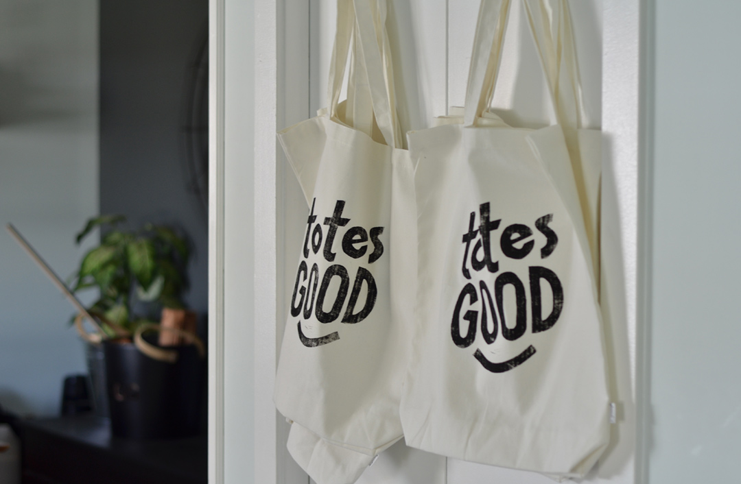
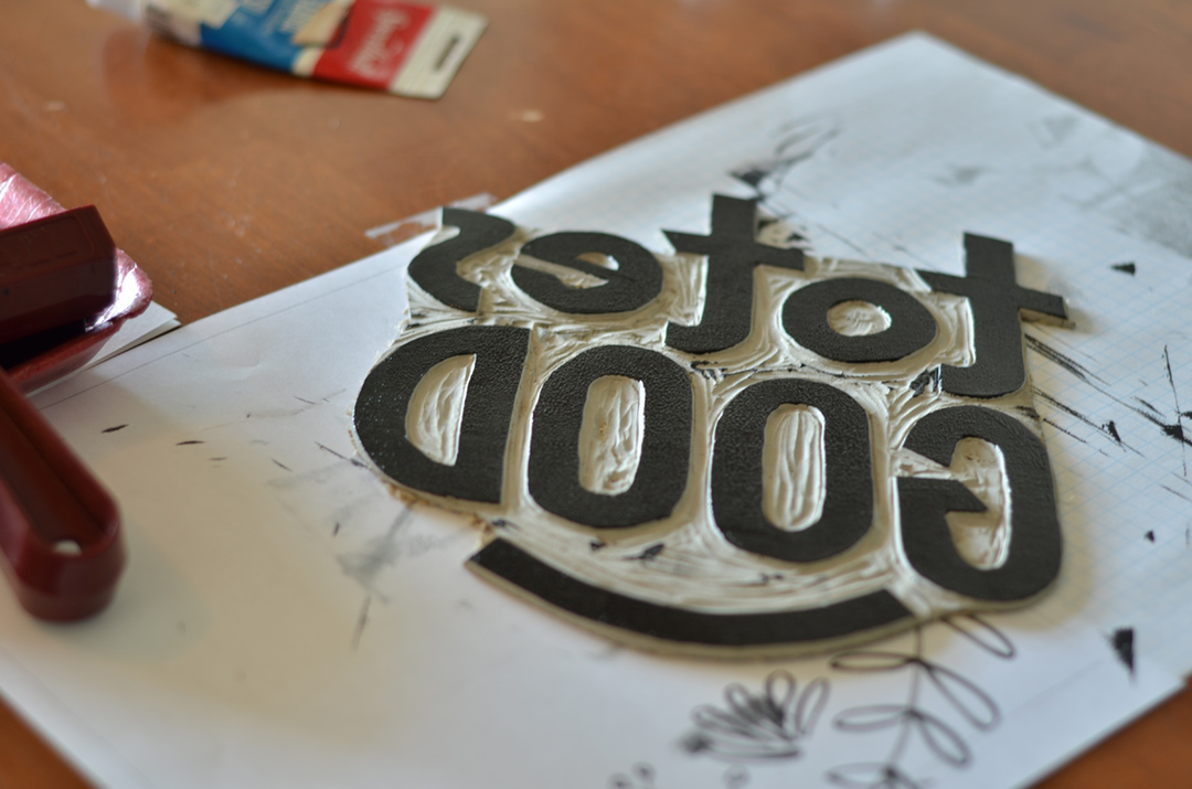
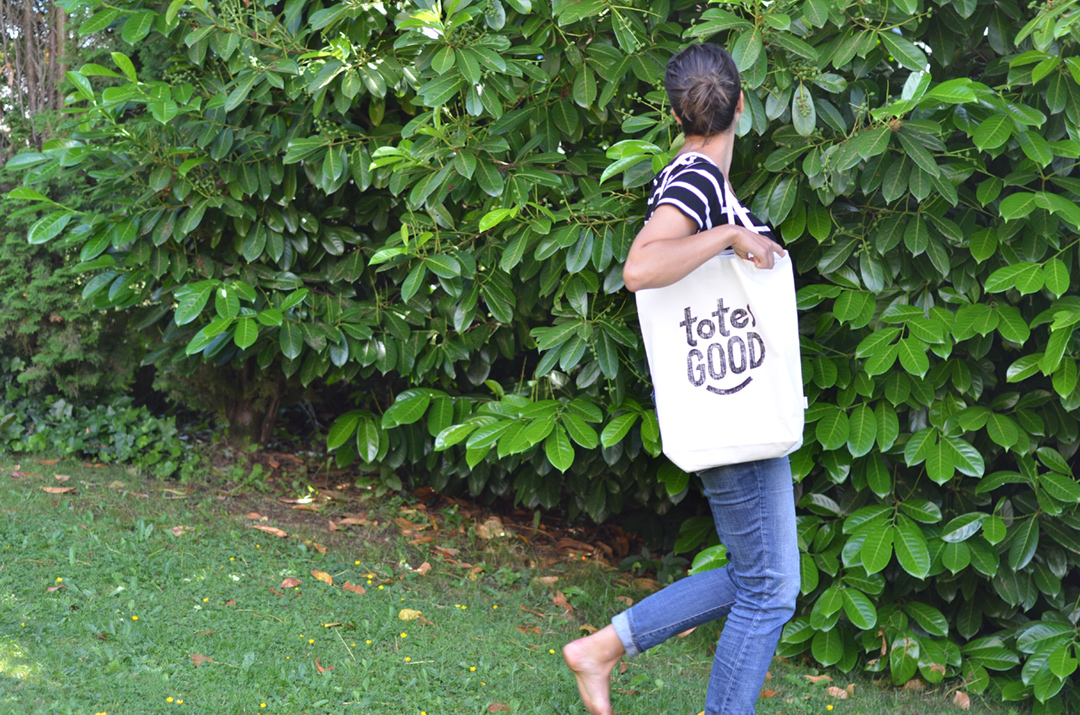
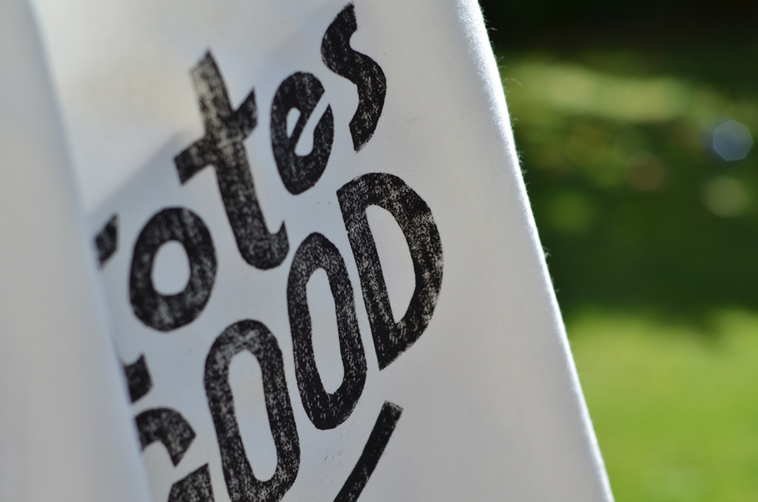
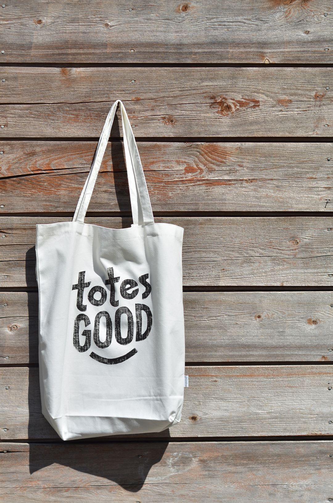
Totes Good! Block Printing Process Video
Last week I got SUPER industrious and cranked out some Tote’s as gifts for a fabulous group of girls. For some reason, I also thought it would be fun to try my hand at creating a process video, so I filmed the fun and then spent a few hours in imovie (high tech!) making this little ditty. What do you think? Should I do this again?
A few extra bits:
- No I don’t have a camera crew, just 8 totes! I moved the tripod for each one and managed to get enough decent footage to put this together!
- I chose the music from a free site based mostly on the fact that it matches up with that little dance I do in the middle. Even though I was working in silence ha!
- “Totes Good” is from Genesis 1:31, “God saw all that he had made, and it was very good.” I wanted the recipients of these totes to be reminded that no matter what, they’re made perfectly, God is good, and our situational experiences don’t change either of these things. Light words for a pretty meaningful sentiment, just the way I like it!
- I really LOVE block printing, and have been toying with the idea of attempting to sell some pieces. What do you think? Would you be interested? How much would you pay for something like this?

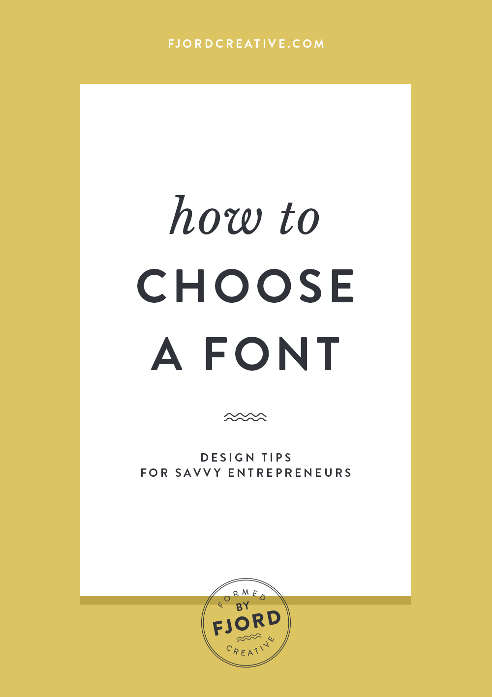
How to Choose a Font—Design Tips for Savvy Entrepreneurs
Fonts! In the world of communication, fonts are the one visual element you CAN’T escape. No matter how simple your approach to design and marketing, if you’re sharing information, you’re choosing a font. And whether you realize it or not, you’re saying something with your font choice.
Here are some of the most important factors to consider when choosing a font, plus some of my favourite recommendations for each. (I use some fancy type terms in this article—if any of them lose you, check out my previous post on typographic terms).
First, Implementation—What are you using the font for?
The first thing you need to do is consider what you’re using the font for, and the implications and limitations that come with it.
Body Copy – the main “body” of a written piece of work. Body copy (like this blog post) is usually set in large blocks, and needs to be not only legible, but easy to read. A readable font is created with proper spacing and ligatures that make subconscious reading easier. One of my professors used to say “a good body font is one that nobody notices.” This is NOT the place to be unique or flashy. A poor type choice for body copy could mean your reader just gets tired of trying to read, regardless of how good your writing is!
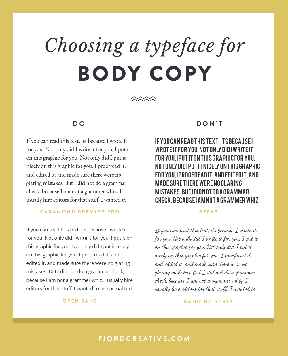
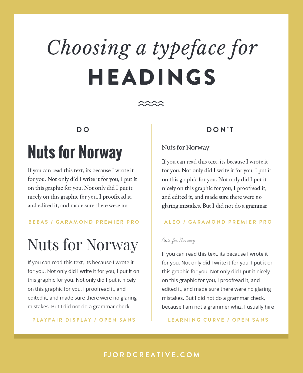
Headings – Headings are an important addition to any piece of communication. Varying your type styles helps provide wayfinding tools for your reader, and choosing the right styles will provide a strong hierarchy of information. If your heading is set in the same style as your body copy, chances are your reader might not even see it, passing over the information they’re looking for entirely. By varying the size and visual weight, a contrasting heading helps your reader know where sections begin and end. A good rule of thumb is to mix a sans-serif with a serif. Your two typefaces should be different enough to contrast. Again, a poor choice in heading could mean your reader gets tired of the effort of finding their way through your writing. Unlike body copy, this is a great place to get creative and bold! Tastefully of course…
Logos – while I am of course a big fan of hiring a professional brand designer to craft you a really special brand (and not just a logo!), it can definitely be one of the business investments you need to work up to. If you’re choosing a typeface for your own logo, you’ll be best served by spending a good amount of time making a careful choice! You’ll want to consider legibility, personality, and quality. Your font choice only has to work for the letters in your logo, so you don’t really have to worry about things like punctuation marks or ligatures. Remember that your logo needs to work at large and small sizes, should have a vertical and horizontal version, and shouldn’t look exactly like someone else’s.You can be brave, but don’t get crazy unless you’re branding Crazy. A clean, intentional look to your logo will lend you a lot of credibility. Make a careful choice!
Social Images – choosing a font for your social media sharing images is somewhere between choosing a heading and a logo font. It’s helpful if the design has a little bit of interest, but it still needs to be versatile enough for any future uses. You’ll want to make sure the type you choose will look good in uppercase and lowercase, dark and light, and be legible at small sizes while also looking good at full-size. You want to be consistent with your typefaces, creating a branded look over all of your posts for the strongest added value to your brand. If your branding already incorporates certain typefaces, stick with these!
Next, Personality—Who is this font saying I am?
Font personality communicates a lot, and I see it overlooked on landscaping trailers everywhere. Some classically misunderstood font personalities are Comic Sans and Papyrus—arguably decently designed fonts—which get used for everything from daycares centers to paintball courses to notary offices to blockbuster movies (*ahem* Avatar). A font with a big personality should be carefully considered and matched with the appropriate big message! The visual characteristics of each font are kind of like our clothing choices. They can say “business” or “casual,” “budget” or “luxury.” They can say “I’m an unpredictable artist!” or “I’ll keep your money safe.”
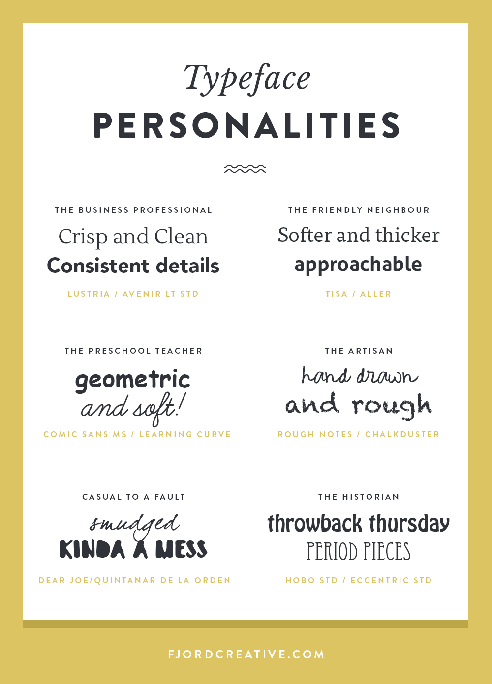
- Crisp, consistent detailing usually communicates professionalism and quality.
- Sharp edges and thin lines can communicate luxury(or stuffiness). Softened edges and thicker lines bring in more friendliness and approachability.
- Geometry combined with soft edges can say “suitable for children,” mimicking the base letterforms we learn to create.
- Rough or imperfect, hand-drawn lines can communicate a human connection or personal effect.
- Grungy or messy detailing, especially in this era of design, can communicate low budget or bad taste. Sorry! Grungy type is a look of the past, and in general is only appropriate for a few industries that take advantage of that connection to the early 2000’s or 90’s era. Some types of music, for instance, or skate / snow brands that are appealing to a certain demographic from that era.
Lastly, Quality—is this font going to hold up for its use?
Font quality can refer to the file type (OTF [opentype] are made to work anywhere, while TTF [truetype] might cause you trouble) or how well the font is designed. Professional type designers spend countless hours perfecting every single detail of each letter, how each letter works with each other letter, or how the letters interact with punctuation. They design different variations for different uses (for example, some fonts have variations like “caption” “book” “display” which infer their intended uses), tweaking the details and spacing so that they work better at larger or smaller sizes. A well-crafted font might have a huge library of “glyphs” – additional letter variations or type elements that allow for other languages and give flexibility to the font.
A poorly crafted font will have none of these things. It may work well for one word in one place, but when you write out a whole line you realize it’s not built with enough space between words. It may look great at a small size, but when you zoom in you realize the details are just mashed in and look really terrible when you use it as a heading. (beware sites like Dafont – there are some gems, but most are poorly crafted and of poor taste)
Too much detail in a font can make it become kitschy or tacky, or just illegible. The key in detailed type is CARE, which usually means crafting it by hand to make sure it really works. Detailed type-based graphics are certainly in-style, but fonts aren’t often capable of achieving this look without heavy customizing.
We can’t overlook licensing either – custom, well-crafted fonts often come with a hefty price tag. There are millions of free fonts, which range in value. If you’re on a budget, the key is identifying the typefaces that are high quality but of such standard use that they’re readily available or open-source (meaning nobody gets paid). These days there is a pretty great selection of fonts that fit into this category (google fonts). There are also a lot of novice type designers doing a pretty good job at creating nice typefaces at affordable prices through vendors like Creative Market. Take note as well, some free fonts are ONLY free if you’re using them for personal use. This means you can’t use on anything you’re getting paid for unless you buy a commercial license.
Basic Font Terminology—Design Tips for Savvy Entrepreneurs
Hello savvy entrepreneur!
I know you—you’re killing it at your biz and managing it yourself too. I want to help! I’m putting together a series of typography tips to aid you in your quest for better branding. You CAN do it yourself, and you can do it well.
Let’s start by clearing up some terms! My next post will focus on choosing the right font, but I can’t talk about fonts without spewing all kinds of typographic lingo you may not be familiar with. This is not an exhaustive list, but some of the most useful terms if you’re wanting to get into the nitty-gritty of your typography.
Typography!
Wikipedia says it best: “Typography is the art and technique of arranging type to make written language legible, readable, and appealing when displayed.” Not to be confused with typology (the study of personality types) or typography (maps). You’ll know you really care about typography when you, too, come close to drawing blood discussing how you should ONLY USE ONE SPACE AFTER A PERIOD!!!
Font
A “font” is actually referring to the digital files you are using when interacting with type on your computer. For instance, if we were using an old-school press and hand setting the letters, we could use the typeface Garamond, which we could also use on the computer—but they would be different fonts. Same typeface, different fonts.
Typeface
The other term you’ll see thrown around is “typeface,” which refers to the actual design. This is the term we really should be using more often, since you don’t really choose the font Garamond, you choose a font of the typeface Garamond. It gets a little grey since we’re assuming we’re all computer-bound, so font isn’t really the wrong term….
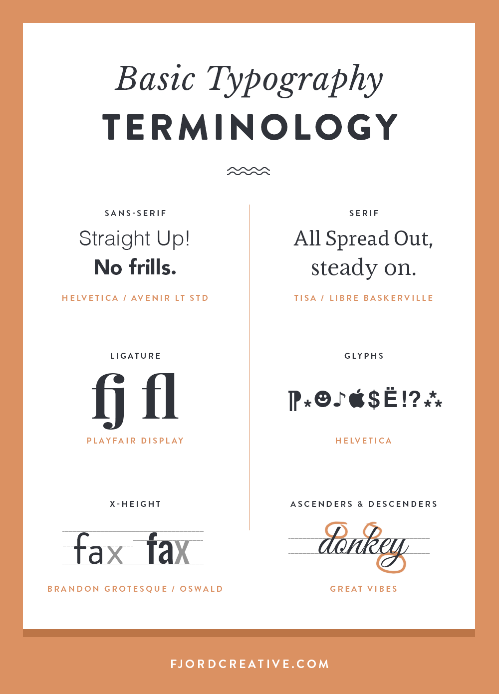
Serif & Sans-Serif
These terms classify two of the main type styles. Serif fonts have little “feet” at the end of each letter form, which some argue improve readability of large blocks of text. Sans-Serif fonts (like this one) have sharp, straight edges that often have a more modern feel. When mixing fonts, it often works well to pair a serif and a sans-serif because their inherent differences make them contrast well. Other common font styles are script (cursive), hand-written (rough and raw), slab serif (large, blocky serifs), and display (creative typefaces that are best for display/headings).
X-height
This refers to the height of the x, or the top of most lowercase letters in a typeface. In general, fonts with dramatic x-heights (either very high or very low) are more difficult to read since they either increase the apparent space between lines of text or decrease it. Fonts with the same point size can look to be very different sizes depending on their x-height. This is why it doesn’t really work to say “all ___ type should be 12pt,” because it depends on the type. It also affects the space you want between lines of text.
Ascenders and Descenders
These terms refer to the parts of the letters that extend above and below the x-height. For example, the lower-case “pqjy’s” have descenders and the “htdb’s” have ascenders. These extensions can affect the visual space between letters and words when they appear stacked vertically. A font with a small x-height and large ascenders and descenders can look really odd when set as body copy, because the spacing between the letters is so atypical. Any sorts of dramatic letter forms that create unexpected spaces will affect the readability of your content.
Leading
This tech term refers to the space between lines of text. In professional typesetting software you can (and usually should!) adapt the leading to fit the typeface. This is often called “line-height” or “line-spacing,” especially on the web, as the CSS command for adjusting the leading is line-height.
Ligature
Well-crafted typefaces have built in ligatures, which are custom letterforms that appear when two letters appear next to eachother. Common ligatures are the fl or fi. The whole reason they exist is to increase legibility, meaning your eyes have less to decipher as they skip over the letterforms. They are intended for body copy, but can look really neat when applied to headings or logos. Sometimes these ligatures are only accessible with a glyphs palette in professional typesetting programs.
Glyphs
Glyphs are all the individual elements in a typeface! Some fonts have only uppercase letters, some have no punctuation, and high-quality fonts often have tons of extras (like fractions, swirly end icons, happy faces etc). These are often only accessible through a “glyphs” palette in advanced typesetting programs like Adobe Indesign.
Web Font vs Desktop Font
This distinction implies different licensing and different capabilities. Glyphs and ligatures often don’t appear properly on the web, so they aren’t included in most web fonts. You sometimes need to pay separate licensing fees for each usage (“desktop” for print and “web” for…well, the internet of course). Web fonts also need to be created and implemented in a way that is specific to the internet. When your website loads for each new user it renders the type anew, and needs to find the font data somewhere (either on your users computer or on the internet). Using a fancy print font on your website will not only be tricky to do, it probably will break your licensing agreement. For this reason, your choices for web fonts are usually limited to what is standard on the web (unless you pay for and work with a service like typekit).
Legibility & Readability
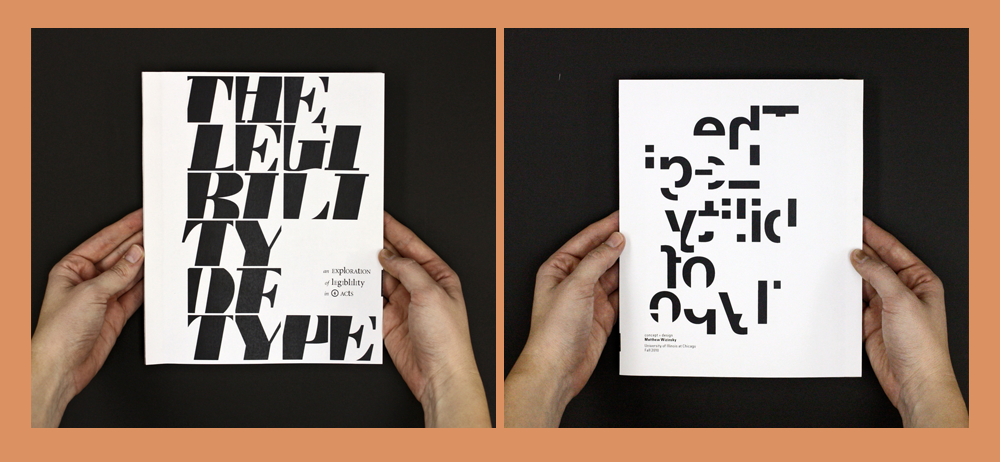
Legibility is a term most of us know, “the quality of being clear enough to read.” Readability on the other hand, which is less of an actual dictionary term, is the ease with which a reader can understand a written text. Legibility is always important to consider, but when you’re creating type-based art or headings, poor legibility isn’t always a bad thing. (see images above by Studio Jungle Cat) Readability is most important when you’re setting body copy, or considering your final layout. When a large block of text is being used to communicate information, you want all of your readers energy being used to understand the information itself, not trying to figure out what the information is in the first place.
Pin to save!
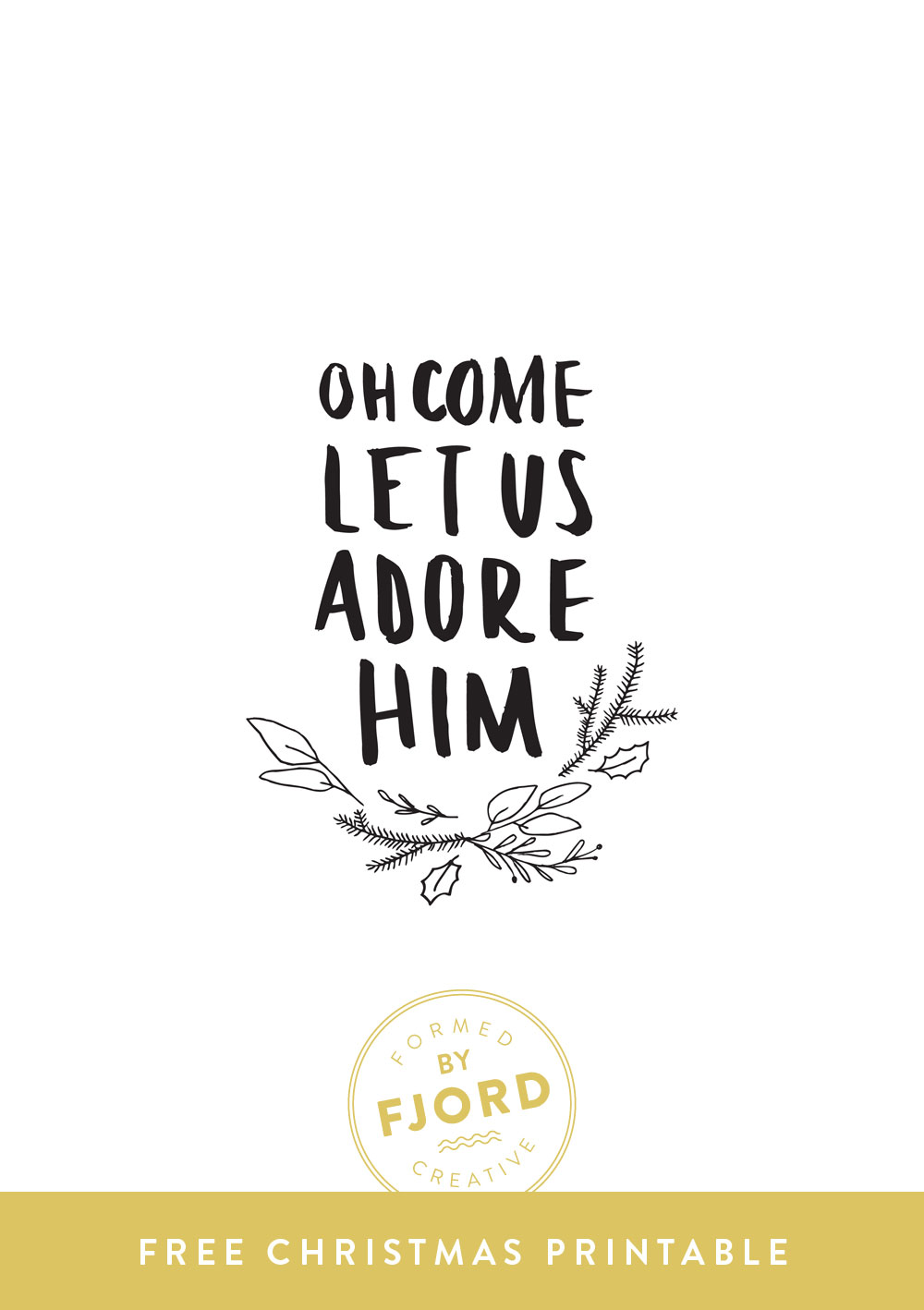
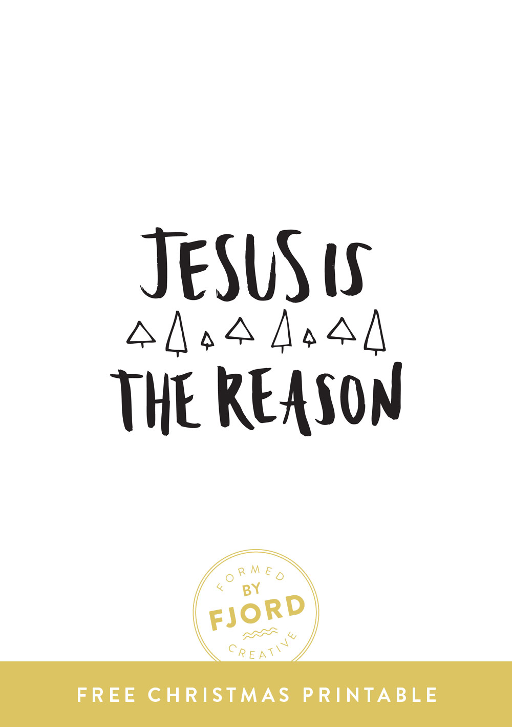
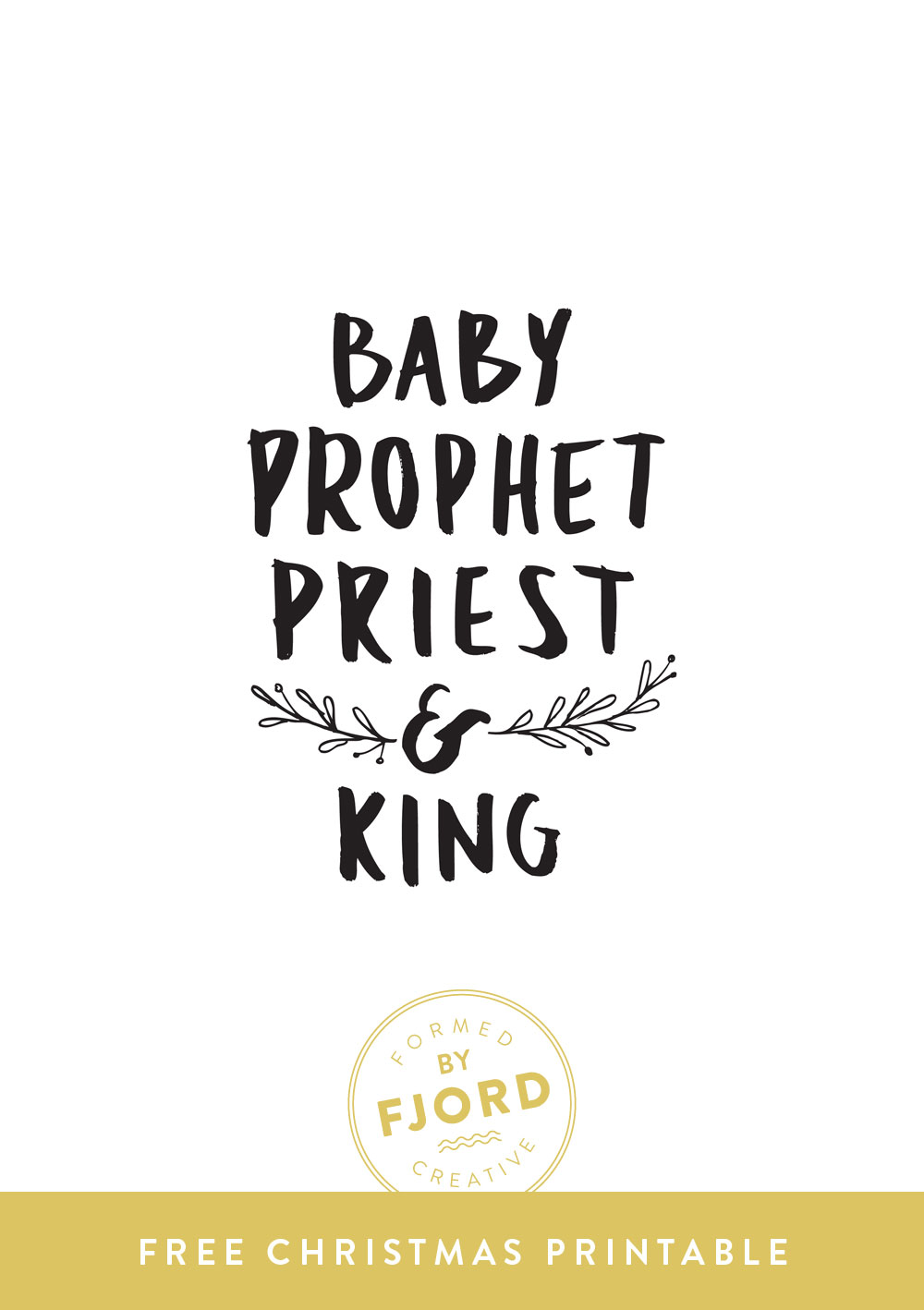
Free Christmas Printables
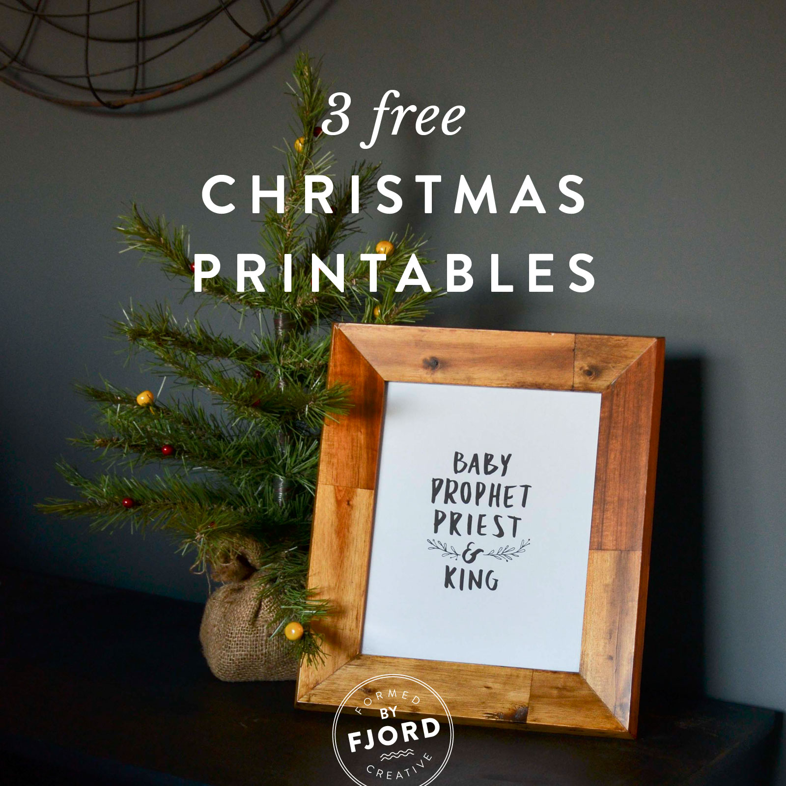
These free Christmas printables are the result of my need for reminders as this holiday season swings into full gear. This Christmas promises to be chalk full of all kinds of things that are really just extraneous, and one of my favourite ways to remind myself of deep truths is to plaster them all over my house! It can be tempting to settle into the refrains we keep hearing over the radio (All I want for Christmassss is youuuu…), but I wanted to intentionally remember what is at the core for me this Christmas season, and every season, really. I’ve turned them into free printable downloads because I don’t think I’m alone in this! I hope you enjoy! // Click on the images below to download each PDF
Welcome to Fjord Creative!
Oh man! This is real! The domain name I purchased in a flurry this summer, between beach trips and diaper duty, is no longer just a plan. The secret instagram account I’ve been filling with images isn’t just for me anymore (come follow me!). Fjord Creative is live! And the best part? I’ve got clients!
Switching to freelance was never a for-sure plan for me. I had always considered it an option for “someday,” knowing that working as a Graphic Designer is actually optimal for at-home operation. As my maternity leave approached its end, it became obvious to me that returning to a full-time office job just wasn’t going to work for our family! Unfortunately, knowing what the “wrong” option is and knowing how to make the “right” one work are two very different things! But here I am. I’ve always freelanced for fun, taking jobs that came along and seemed exciting. I have a long history as a print designer, and have been working more with website design and information architecture in the three or four years. I really love illustration and using traditional mediums in my design work, and I’m looking forward to finding more ways to explore those. I’ve even dabbled in motion graphics, and would love to get more learnin in that direction so that I can make more beautiful things move!
But kids, the point here is that I’ve STARTED SOMETHING SPECIAL. Regardless of where this ends up, its going to be life-changing. I’ve already had to face down my self-confidence and monetary-value demons, and I’m sure there are more lurking around the corner! But I’ve also experienced so much encouragement and affirmation on this new direction, and while the scary stuff is still scary, the exciting stuff just becomes more exciting. And now I’m blogging…! I’m hoping to use this space to share work, inspiration, tips and tricks (for all you money-saving DIYers), and of course generate some exposure.
But I’d love to hear from you! Is there anything you think I could help you with?