Hello savvy entrepreneur!
I know you—you’re killing it at your biz and managing it yourself too. I want to help! I’m putting together a series of typography tips to aid you in your quest for better branding. You CAN do it yourself, and you can do it well.
Let’s start by clearing up some terms! My next post will focus on choosing the right font, but I can’t talk about fonts without spewing all kinds of typographic lingo you may not be familiar with. This is not an exhaustive list, but some of the most useful terms if you’re wanting to get into the nitty-gritty of your typography.
Typography!
Wikipedia says it best: “Typography is the art and technique of arranging type to make written language legible, readable, and appealing when displayed.” Not to be confused with typology (the study of personality types) or typography (maps). You’ll know you really care about typography when you, too, come close to drawing blood discussing how you should ONLY USE ONE SPACE AFTER A PERIOD!!!
Font
A “font” is actually referring to the digital files you are using when interacting with type on your computer. For instance, if we were using an old-school press and hand setting the letters, we could use the typeface Garamond, which we could also use on the computer—but they would be different fonts. Same typeface, different fonts.
Typeface
The other term you’ll see thrown around is “typeface,” which refers to the actual design. This is the term we really should be using more often, since you don’t really choose the font Garamond, you choose a font of the typeface Garamond. It gets a little grey since we’re assuming we’re all computer-bound, so font isn’t really the wrong term….
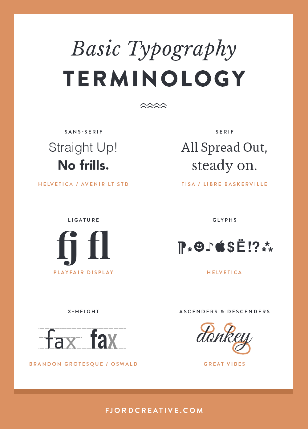
Serif & Sans-Serif
These terms classify two of the main type styles. Serif fonts have little “feet” at the end of each letter form, which some argue improve readability of large blocks of text. Sans-Serif fonts (like this one) have sharp, straight edges that often have a more modern feel. When mixing fonts, it often works well to pair a serif and a sans-serif because their inherent differences make them contrast well. Other common font styles are script (cursive), hand-written (rough and raw), slab serif (large, blocky serifs), and display (creative typefaces that are best for display/headings).
X-height
This refers to the height of the x, or the top of most lowercase letters in a typeface. In general, fonts with dramatic x-heights (either very high or very low) are more difficult to read since they either increase the apparent space between lines of text or decrease it. Fonts with the same point size can look to be very different sizes depending on their x-height. This is why it doesn’t really work to say “all ___ type should be 12pt,” because it depends on the type. It also affects the space you want between lines of text.
Ascenders and Descenders
These terms refer to the parts of the letters that extend above and below the x-height. For example, the lower-case “pqjy’s” have descenders and the “htdb’s” have ascenders. These extensions can affect the visual space between letters and words when they appear stacked vertically. A font with a small x-height and large ascenders and descenders can look really odd when set as body copy, because the spacing between the letters is so atypical. Any sorts of dramatic letter forms that create unexpected spaces will affect the readability of your content.
Leading
This tech term refers to the space between lines of text. In professional typesetting software you can (and usually should!) adapt the leading to fit the typeface. This is often called “line-height” or “line-spacing,” especially on the web, as the CSS command for adjusting the leading is line-height.
Ligature
Well-crafted typefaces have built in ligatures, which are custom letterforms that appear when two letters appear next to eachother. Common ligatures are the fl or fi. The whole reason they exist is to increase legibility, meaning your eyes have less to decipher as they skip over the letterforms. They are intended for body copy, but can look really neat when applied to headings or logos. Sometimes these ligatures are only accessible with a glyphs palette in professional typesetting programs.
Glyphs
Glyphs are all the individual elements in a typeface! Some fonts have only uppercase letters, some have no punctuation, and high-quality fonts often have tons of extras (like fractions, swirly end icons, happy faces etc). These are often only accessible through a “glyphs” palette in advanced typesetting programs like Adobe Indesign.
Web Font vs Desktop Font
This distinction implies different licensing and different capabilities. Glyphs and ligatures often don’t appear properly on the web, so they aren’t included in most web fonts. You sometimes need to pay separate licensing fees for each usage (“desktop” for print and “web” for…well, the internet of course). Web fonts also need to be created and implemented in a way that is specific to the internet. When your website loads for each new user it renders the type anew, and needs to find the font data somewhere (either on your users computer or on the internet). Using a fancy print font on your website will not only be tricky to do, it probably will break your licensing agreement. For this reason, your choices for web fonts are usually limited to what is standard on the web (unless you pay for and work with a service like typekit).
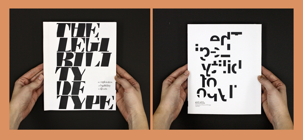
Legibility & Readability
Legibility is a term most of us know, “the quality of being clear enough to read.” Readability on the other hand, which is less of an actual dictionary term, is the ease with which a reader can understand a written text. Legibility is always important to consider, but when you’re creating type-based art or headings, poor legibility isn’t always a bad thing. (see images above by Studio Jungle Cat) Readability is most important when you’re setting body copy, or considering your final layout. When a large block of text is being used to communicate information, you want all of your readers energy being used to understand the information itself, not trying to figure out what the information is in the first place.
Pin to save!